Overview
The EA SPORTS App needed a design system that could scale with the product, better reflect the EA SPORTS brand, and reduce inconsistencies across iOS and Android. As new features were being added, gaps between design and engineering were making the experience harder to maintain and slower to evolve.

As part of the EA SPORTS App design team, I contributed to the redesign and migration of the app’s UI system across key product areas. My work focused on auditing the existing experience, exploring new visual and interaction patterns, refining reusable components, and supporting implementation with engineering.
Before designing anything, the team and I dived into FigJam and created a full tapestry of the current experience. This gave us a birdseye view of the entire UI and helped us identify repeated patterns, inconsistent treatments, high-traffic areas, and components that would have the biggest impact if tackled first.

Problem
The existing design system struggled to communicate the EA SPORTS brand, while the experience also missed some key features that sports fans would be familiar with in competitor experiences.
Rather than redesigning everything at the same depth, we prioritised areas where new product requirements, missing functionality or high user value justified deeper exploration.

The team was tasked with creating concepts of a few key screens, before coming together to discuss what we felt worked and what we’d like to move forward with.
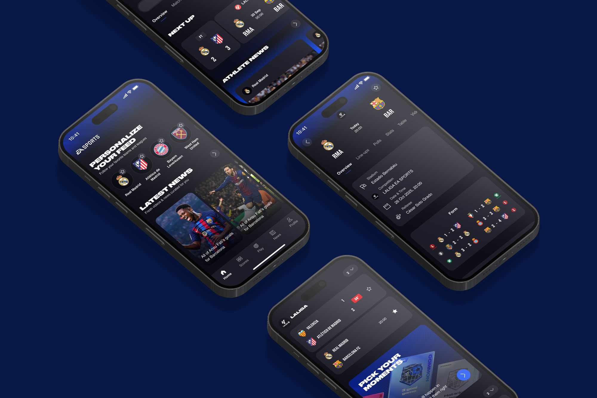
One of my focus areas was the creation of a home screen, which tied together scores, news and gamification features, while also identifying fandom. Another key focus was how one of our new gamification features (Moments) could be further ingrained within the core scores experience.
We compared concepts against brand fit, scalability, content flexibility, engineering effort and how well each route supported live match information.

We created a stronger brand presence through introducing subtle blue gradients, a new blue-grey elevation system, clearer hierarchy for scores/match context using stronger typography & spacing rules, and reusable layouts & components that could support pre-live-post match states.


Rather than creating every new component and implementing it in one go, we chose to gracefully migrate to the new design system over the course of a couple of months. Because the app was already live, the migration needed to happen incrementally without blocking ongoing feature work.
1. Recreate existing screens: Once every screen and state that appears across the app had been designed, we then used them to guide conversations with Android & iOS developers to understand how to best roll out the new design system without disrupting the experience.
2. Map the old UI to new tokens: The initial phase was to create and implement the new colour system tokens, in which I created a mapping document for them to use. As the existing implementation had a bit of a mish-mash of tokens throughout the build, a percentage of the migration required me to pull tokens from the code base and manually match them up to our new system.

3. Start with high-impact shared areas: Once this was done, it was then our chance to swap the typography using a similar method, before starting to implement the high impact features first. This started with the match centre headers, the app navigation, and score cards.
4. Roll out incrementally: Over the next couple of months, we worked side-by-side with both the Android & iOS teams to create every new component’s front end, before the wider team prioritised the implementation into a backlog.

Outcome
The work created a clearer foundation for evolving the EA SPORTS App across iOS and Android. By auditing the existing experience, defining reusable UI patterns and beginning the migration through high-impact areas, the team had a stronger shared language between design and engineering and a more scalable base for future feature work.